KOHO / Marketing Website ↓
Designed to help Canadians take control of their financial future.


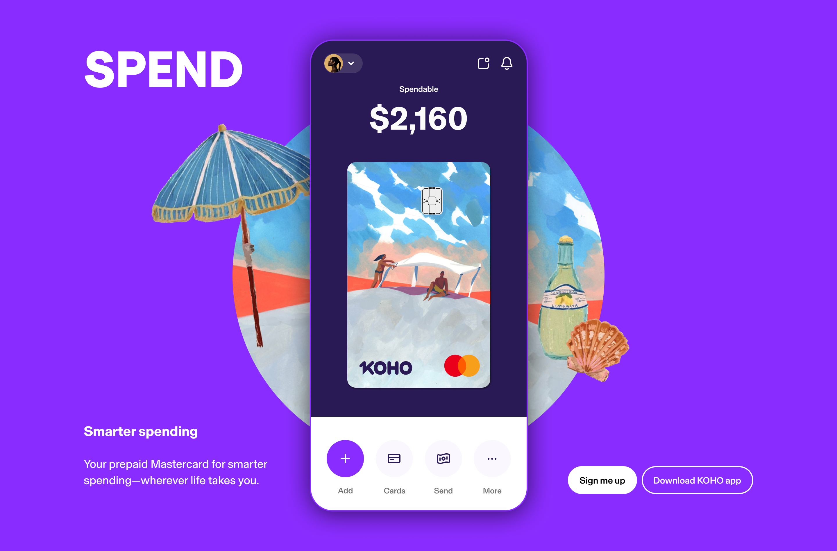


Creative Direction, UX Strategy, Design @ KOTO
KOHO started as a prepaid card, but the ambition was always bigger: to become a trusted partner in financial wellness for the next generation. The challenge was to shift the brand from transactional to transformational, creating a seamless, supportive, and empowering experience across its most high-traffic digital touchpoints.
I led creative direction and experience strategy for the project, working closely with my Experience Director to help KOHO evolve from utility to empowerment. Together, we reframed the product not just as a service, but as a platform for progress. Through hands-on UX work, stakeholder alignment, and a roadmap rooted in real user feedback, we transformed the homepage, product pages, and core navigation into something more cohesive, more intentional, and more human.
We grounded the work in three actionable experience principles: Seamless, Supportive, and Empowering. These values became the lens through which we evaluated every piece of content, layout, and interaction — ensuring the site didn’t just look good, but made people feel informed, confident, and in control.
From simplifying complex product explanations to embedding contextual help, from scaling content systems to rethinking the structure of the homepage, we built a framework that served both new users and long-time customers. Along the way, we created a design system that tightened visual cohesion and improved usability across KOHO’s most visited pages, including Credit Building and Partner Offers.
The outcome was a site that spoke to real people with clarity and purpose. A site that could scale, educate, and inspire. And a brand experience that finally felt as helpful as the mission behind it.
More Design ↓